Second Bugzilla-related user script today: Bugzilla 3.2 introduced a keyword chooser that always pops up when you click on the keywords field. Sadly, it keeps you from entering the keywords by hand, even if you know exactly what you want to type. Choosing it from the list and clicking the arrow, then okay takes much longer.
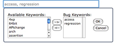
So here's another very simple Greasemonkey user script that just reverts to the original behavior of a simple text field: bugzilla-fix-keywords.user.js (click to install)

I really think instead of the current chooser, a simple keyword suggestion feature should be used that works somehow like the del.icio.us tag find-as-you-type feature:
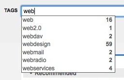
That could be another user script (or rather an extension to this simple script here). Anyone feel like making it?

Update: This user script of mine has also been deprecated by the fix introduced with bug 452734 -- we now have a convenient auto-complete feature, similar to the one I suggested above. Great! Here's a screenshot:

Read more…

Last night, Mozilla's Bugzilla bug tracker was updated to Bugzilla 3.2 with a lot of UI changes, some of which are improvements, others are not.

One of the things that struck me as weird is how all flags, resolutions, etc. moved to the top of the page, while the "commit" button remained at the bottom, by the comment field. That means to resolve a bug, you need to (including the additional click that is now needed to pick something from the resolutions dropdown list):

  • Click on the "status" dropdown list
  • Click on RESOLVED
  • Scroll all the way down the page
  • Click on Commit

So I decided to throw a quick Greasemonkey user script together to put an additional commit button to the top of the page (just so we can drop the scrolling part), like this:

And here's the script for your enjoyment: bugzilla-commit.user.js (click to install)

(Please note, it remotely imports jquery from jquery's google code repository; that's probably something that should change in version 0.2 ;) ).

Update: It seems, this patch has been upstreamed and deployed at least on the Mozilla bugzilla instance. That makes this user script obsolete. In a good way :)

Read more…

When I recently watched a slideshow on flickr, I noticed this in the slideshow settings:

It seems, flickr developers watch the Simpsons too. The word embiggen, along with cromulent, was introduced (read: made up) in the episode "Lisa the Iconoclast" and has since been widely used in popular culture. So widely even, that at least cromulent made it into Webster's New Millennium Dictionary of English as a slang term.

Hm. Flickr is re-gaining some sympathy here (for this and other reasons I may soon blog about).

Read more…

Uhm, no, thanks.

(Update: A few people have wondered if I did not install Silverlight merely because it is produced by Microsoft. This is not the case, as you can read in more detail in the discussions in the comments to this article. Thanks.)

Read more…

I was just checking out a website with JavaScript disabled, then surfed over to facebook (accidentally) without switching JS back on, where I was welcomed with the following page (click on it to see it in its full beauty):

I love how gracefully they degrade to... an empty page...

Relying on JavaScript completely and just not returning a page at all if you don't have it is a no-go in web development. At the very least, you should display a page stating why your services can't be used without a particular technology, and provide hints on how to fix that.

Probably, the empty page only occurs because I logged in with JS enabled, then returned to the page with it disabled, but still it's not a great user experience either way.

Depending on the software architecture, it is even relatively easy to provide a working page for "no script" users while keeping fancy JavaScript elements.

At AMO, we make an effort to keep all public parts of the website accessible to non-JS users as well so that the site can be used by the widest audience possible, and the development effort is far smaller than I imagined, due to language constructs like <noscript> that allow displaying buttons etc. that wouldn't be needed in the "AJAXy" version of the page.

When I look at this, I hope facebook was not infected by its evil German stepchild "StudiVz", as far as code quality is concerned. That apparent facebook clone, when it was first introduced, was infamous for its numerous, severe shortcomings in such minor regards as security, privacy, user experience, and probably a number of other important buzzwords as well (also stated by Facebook themselves in the context of their intellectual property lawsuit against StudiVZ: "As with any counterfeit product, Studivz's uncontrolled quality standards for service, features and privacy negatively impact the genuine article.", but I am digressing...)

Read more…

Since I filled up my Netflix queue on the weekend and they only ship DVDs on weekdays, my Netflix queue said

We'll send your first available movie on Monday.

all weekend long.

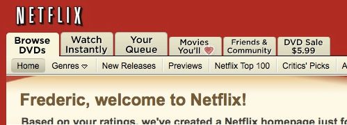
Now I just looked at the queue to see if it shipped, and now it says:

Uhm, Netflix, what's going on? I've heard rumors before that you stretch out DVD shippings in order to reduce the amount of DVDs per month and customer, but do you need to do so with a new customer and his first DVD?

Then again, maybe they haven't survived their huge shipping issues from last week quite yet, in spite of my entire queue saying "Availability: Now".

It depends on your individual definition of "now", after all.

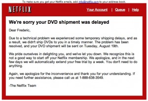
Update: Interesting, Netflix sent me an email apologizing about the bad start of my membership, extending my free trial for a week. Well then.

Read more…

When I went to Giant Eagle earlier this week, I got a two DVDs from the Redbox DVD rental machine in front of the store, as I felt like watching a movie and they only charge 1 dollar plus tax a day, which is really cheap. Sadly, one of the DVDs was so badly scratched that my drive wouldn't even read it: After a few unsuccessful tries at spinning up the disc, it spit it right back out -- though my DVD player isn't even usually that picky about what it eats (I'll spare you the reference to Americans and their fast food).

Sure enough, I called customer service (1-800-REDBOX3, in case you were wondering) and they apologized, marked the disc as "to be removed from circulation" and gave me two codes for free rentals in return.

So I took back the discs, and got two new ones -- only to notice that one of them was, yet again, looking like somebody had used it as a coaster:

Though they gave me another replacement code, I decided to try something different to satisfy my urge for movies and TV shows: I signed up for Netflix.

The idea of finding a new movie in the mail box when I come home from work sounded appealing to me. So I already put 20 discs into the queue which, considering I have the 1-DVD-at-a-time-plan, will probably take ages to go through, but we'll see how it goes. Another cool feature is their "watch instantly" collection, but I may blog about that some other time.

I wonder what my readers use to get to their movies? Let me know in the comments.

Read more…

There used to be a time when twitter.com spammers still made an effort to disguise the fact that they're, well... spammers:

Subtle, really!

Read more…

Just recently I ranted about how bad it is that GMail auto-adds every possible email address it can get its hands on to your contacts, making them utterly cluttered with the most random people on the planet, including "remove me from this mailinglist" addresses and others you never want to see again.

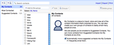
It seems as if Google heard me (and many others): They now introduced a new section "suggested contacts" that they dump everybody and their brother's email address into, but the people you actually want to have as contacts stay in an also newly created "My Contacts" folder.

This gives you the convenience of still adding people you email to the auto-complete feature (which, in and by itself is not so bad), while not hopelessly cluttering your contacts. Exactly what I want!

Well, thank you, Google. Read more about it on the GMail blog.

Read more…

So, Wordpress on the iPhone is pretty cool. Obviously, typing an entire blog post on there can become tedious, but if you just want to tell the world about something that happened to you five seconds ago, it's definitely a must-have.

Read more…