A few days ago, a colleague of mine mentioned that the font I was using on my blog looked borderline ugly on Linux. Here's a screen shot:

As you can see, the uneven glyphs make it look goofy and certainly hard to read. The problem was that I used a font that seems to be present on many Mac and Windows computers, but was unavailable on my colleague's Linux box. His browser tried to substitute it with a different font -- with limited success.

So I decided to use a nifty little web feature called @font-face that allows me to define and embed my desired fonts into the website. Ideally, every browser on every platform will download the fonts I am using, and display my blog the way it is intended to look. The fonts I am using now are called Goudy Bookletter 1911 (for the headings) and Droid Serif (for the text).

I hope you like the new fonts and find them pleasant to read. If you notice any problems, however, please let me know!

Thanks for the hint, Lars, and thanks to all commenters for providing valuable feedback!

Read more…

There is a Belorussian version of this article provided by PC.


One of the talks I really enjoyed at recent FOSDEM was Paul and Tristan's presentation on Hackability. (Tristan uploaded the English slides to slideshare, as well as the French ones).

Essentially, it was a great promotion for keeping the Web (and Firefox as the tool we view it through) (both legally and technically) open, its building blocks visible and interchangeable. If you can't open it, you don't own it.

As a result, this also means the "view source" function is not there to feed the user's idle curiosity, it is a vital and irreplaceable part of the Web. Likewise, a tool like Firebug does not exist to "break" other people's websites. Instead, it helps us to use the web the way it was meant to be used.

Recently, a colleague of mine (don't remember who, sorry) linked to a little website called patch culture.org, that, in spite of its simple appearance, promotes exactly that: using the Web the way it was meant to be used, fixing, improving the Web on our way through other people's sites, and better yet, share our changes with the people who own the sites. Their steps are easy: 1) Install Firebug, 2) change a website, 3) email a patch to the owner.

Sounds easy (to geek ears, anyway) but is harder than it looks. For starters, how do I get my changes out of Firebug? It's a concept we could call "diffability". If I have to write a book describing what I did to some website's DOM nodes and CSS rules, I am far less likely to fix someone else's website for them than when there is an easy way for me to do it. Granted: Even if Firebug let me export a unified diff, owners of non-trivial, framework-based web sites wouldn't be able to just go ahead and apply it on their codebase. However, diffs are human engineer readable. Without losing a ton of words, the website owner could look at the changes I made and choose to apply them to their software in the appropriate spots.

Second, how do I make my changes stick? We Open Source developers are of course some of the more altruistically inclined citizens of the Web, still if you are going to fix someone's website, you are likely to do so to lower your own annoyance level first, then everybody else's. Therefore, you want your changes to "stick", if or if not the website owner decides to accept and deploy your changes.

Thankfully, this is achievable, though it involves a little bit of a hassle. There are add-ons out there, most notably Stylish (for CSS-based changes) and Greasemonkey (for JS-based changes). These two were recently joined by Jetpack Page Mods. While Greasemonkey is a solid platform with tons of contributions, I see its biggest flaw in missing a solid standard library that takes the pain out of JavaScript, a problem Jetpack mitigates by shipping with jQuery included. In comparison, using jQuery with Greasemonkey is many things, none of which is "beautiful". If Greasemonkey wants to stay the technology of choice for "web hackers", it needs a standard library. Only then will it fill its place as a lightweight extension engine in the future, (yes, in spite of its recent inclusion in Chrome). It would be a twisted situation if it became easier to write full-blown (Jetpack-based) extensions than writing a user script. It's the reason I am already writing small website changes as Jetpacks and not GM scripts, and I am not the only one. But because competition is good for business, on the Web as much as elsewhere, I hope the Greasemonkey guys stay on top of their game.

In summary:

  • Let's make and keep the Web open and hackable!
  • We can change web sites, but it's hard to share what we did. A great way towards more open hacking would be a diff engine in Firebug. Even if it only exports pseudo-diffs, or even if the diffs can't be applied with one click unless you run a fully static website.
  • Finally, it's possible but hard to make changes stick. Greasemonkey is a strong contender in the field, but if they want to keep being the number one "hackability engine", they'll need to make writing scripts easier by adding a decent standard library. After all, it is not the 20th century anymore.

Read more…

This is another cross-post of an article I wrote for the hacks.mozilla.org blog. It shows off some of the fun stuff web developers can do with the -moz-box-shadow feature that will be released as part of Firefox 3.5.

Another fun CSS3 feature that's been implemented in Firefox 3.5 is box shadows. This feature allows the casting of a drop "shadow" from the frame of almost any arbitrary element.

As the CSS3 box shadow property is still a work in progress, however, it's been implemented as -moz-box-shadow in Firefox. This is how Mozilla tests experimental properties in CSS, with property names prefaced with "-moz-". When the specification is finalized, the property will be named "box-shadow."

How it works

Applying a box shadow to an element is straightforward. The CSS3 standard allows as its value:

none | <shadow> [ <shadow> ]*

where <shadow> is:

<shadow> = inset? && [ <length>{2,4} && <color>? ]

The first two lengths are the horizontal and vertical offset of the shadow, respectively. The third length is the blur radius (compare that to the blur radius in in the text-shadow property). Finally the fourth length is the spread radius, allowing the shadow to grow (positive values) or shrink (negative values) compared to the size of the parent element.

The inset keyword is pretty well explained by the standard itself:

if present, [it] changes the drop shadow from an outer shadow (one that shadows the box onto the canvas, as if it were lifted above the canvas) to an inner shadow (one that shadows the canvas onto the box, as if the box were cut out of the canvas and shifted behind it).

But talk is cheap, let's look at some examples.

To draw a simple shadow, just define an offset and a color, and off you go:

 -moz-box-shadow: 1px 1px 10px #00f;


simple box shadow

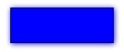
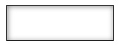
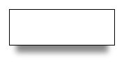
(Each of the examples in this article are live examples first, followed by a screen shot from Firefox 3.5 on OSX).

Similarly, you can draw an in-set shadow with the aforementioned keyword.

-moz-box-shadow: inset 1px 1px 10px #888;


inset box shadow

With the help of a spread radius, you can define smaller (or bigger) shadows than the element it is applied to:

-moz-box-shadow: 0px 20px 10px -10px #888;


box shadow with spread radius

If you want, you can also define multiple shadows by defining several shadows, separated by commas (courtesy of Markus Stange):

-moz-box-shadow: 0 0 20px black, 20px 15px 30px yellow, -20px 15px 30px lime, -20px -15px 30px blue, 20px -15px 30px red;


multiple box shadows

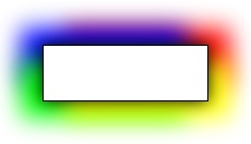
The different shadows blend into each other very smoothly, and as you may have noticed, the order in which they are defined does make a difference. As box-shadow is a CSS3 feature, Firefox 3.5 adheres to the CSS3 painting order. That means, the first specified shadow shows up on top, so keep that in mind when designing multiple shadows.

As a final example, I want to show you the combination of -moz-box-shadow with an RGBA color definition. RGBA is the same as RGB, but it adds an alpha-channel transparency to change the opacity of the color. Let's make a black, un-blurred box shadow with an opacity of 50 percent, on a yellow background:

-moz-box-shadow: inset 5px 5px 0 rgba(0, 0, 0, .5);


box shadow with RGBA

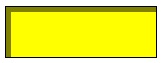
As you can see, the yellow background is visible though the half-transparent shadow without further ado. This feature becomes particularly interesting when background images are involved, as you'll be able to see them shining through the box shadow.

Cross-Browser Compatibility

As a newer, work-in-progress CSS3 property, box-shadow has not yet been widely adopted by browser makers.

  • Firefox 3.5 supports the feature as -moz-box-shadow, as well as multiple shadows, the inset keyword and a spread radius.
  • Safari/WebKit has gone down a similar route as Firefox by implementing the feature as -webkit-box-shadow. Multiple shadows are supported since version 4.0, while neither inset shadows nor the spread radius feature are supported yet in WebKit.
  • Finally, Opera and Microsoft Internet Explorer have not yet implemented the box shadow property, though in MSIE you may want to check out their proprietary DropShadow filter.

To achieve the biggest possible coverage, it is advisable to define all three, the -moz, -webkit, and standard CSS3 syntax in parallel. Applicable browsers will then pick and adhere to the ones they support. For example:

 -moz-box-shadow: 1px 1px 10px #00f;
 -webkit-box-shadow: 1px 1px 10px #00f;
 box-shadow: 1px 1px 10px #00f;

The good news is that the box-shadow property degrades gracefully on unsupported browsers. For example, all the examples above will look like plain and boring boxes with no shadow in MSIE.

Conclusions

The CSS3 box-shadow property is not yet as widely available in browsers (and therefore, to users) as, for example, the text-shadow property, but with the limited box shadow support of WebKit as well as the full support provided by Firefox 3.5 (as far as the current status of the feature draft is concerned), more and more users will be able to see some level of CSS box shadows.

As a web developer, you can therefore use the feature, confident that you are giving users with modern browsers an improved experience while not turning away users with older browsers.

Further resources Documentation

Examples

Read more…

This is a cross-post of an article I wrote for the hacks.mozilla.org blog. It shows off some of the fun stuff web developers can do with the text-shadow feature that will be released as part of Firefox 3.5.

The text-shadow CSS property does what the name implies: It lets you create a slightly blurred, slightly moved copy of text, which ends up looking somewhat like a real-world shadow.

The text-shadow property was first introduced in CSS2, but as it was improperly defined at the time, its support was dropped again in CSS2.1. The feature was re-introduced with CSS3 and has now made it into Firefox 3.5.

How it Works

According to the CSS3 specification, the text-shadow property can have the following values:

none | [<shadow>, ] * <shadow>,

<shadow> is defined as:

[ <color>? <length> <length> <length>? | <length> <length> <length>? <color>? ],

where the first two lengths represent the horizontal and vertical offset and the third an optional blur radius. The best way to describe it is with examples.

We can make a simple shadow like this, for example:

text-shadow: 2px 2px 3px #000;
A simple shadow

(All of the examples are a live example first, then a picture of the working feature — so you can compare your browser’s behavior with the one of Firefox 3.5 on OSX)

If you are a fan of hard edges, you can just refrain from using a blur radius altogether:

text-shadow: 2px 2px 0 #888;
I don’t like blurs

Glowing text, and multiple shadows

But due to the flexibility of the feature, the fun does not stop here. By varying the text offset, blur radius, and of course the color, you can achieve various effects, a mysterious glow for example:

text-shadow: 1px 1px 5px #fff;
Glowing text

or a simple, fuzzy blur:

text-shadow: 0px 0px 5px #000;
Blurry text

Finally, you can add ”more than one shadow”, allowing you to create pretty “hot” effects (courtesy of http://www.css3.info/preview/text-shadow/ css3.info):

text-shadow: 0 0 4px white, 0 -5px 4px #FFFF33, 2px -10px 6px #FFDD33, -2px -15px 11px #FF8800, 2px -25px 18px #FF2200
Multiple shadows are hot

The number of text-shadows you can apply at the same time in Firefox 3.5 is — in theory — unlimited, though you may want to stick with a reasonable amount.

Like all CSS properties, you can modify text-shadow on the fly using JavaScript:

Animated shadows with JavaScript

Start/stop animation

Performance, Accessibility and Cross-Browser Compatibility

The times of using pictures (or even worse, Flash) for text shadows on the web are numbered for two reasons:

First, there are significant advantages to using text instead of pictures. Not using pictures saves on bandwidth and HTTP connection overhead. Accessibility, both for people who use screen readers and search engines, is greatly improved. And page zoom will work better because the text can be scaled instead of using pixel interpolation to scale up an image.

Second this feature is largely cross-browser compatible:

  • Opera supports text-shadow since version 9.5. According to the Mozilla Developer Center, Opera 9.x supports up to 6 shadows on the same element.
  • Safari has had the feature since version 1.1 (and other WebKit-based browsers along with it).
  • Internet Explorer does not support the text-shadow property, but the feature degrades gracefully to regular text. In addition, if you want to emulate some of the text-shadow functionality in MSIE, you can use Microsoft’s proprietary ”Shadow” and ”DropShadow” filters.
  • Similarly to MSIE, when other, older browsers do not support the feature (including Firefox 3 and older), they will just show the regular text without any shadows.

A caveat worth mentioning is the ”drawing order”: While Opera 9.x adheres to the CSS2 painting order (i.e., the first specified shadow is drawn at the bottom), Firefox 3.5 adheres to the CSS3 painting order (the first specified shadow is on top). Keep this in mind when drawing multiple shadows.

Conclusions

text-shadow is a subtle but powerful CSS feature that is — now that it is supported by Firefox 3.5 — likely to be widely adopted across the web in the foreseeable future. Due to its graceful degradation in older browsers, it can safely be used by developers and will, over time, be seen by more and more users.

Finally, some words of wisdom: Like any eye candy, use it like salt in a soup — with moderation, not by the bucket. If the web developers of the world overdo it, text-shadow may die a short, yet painful death. It would be sad if we make users flinch at the sight of text shadows like typography geeks at the sight of “Papyrus”, and thus needed to bury the feature deeply in our treasure chest.

That being said: Go try it out!

Further resources

Documentation

Examples

Read more…

I just implemented a little eye candy for my blog: Language icons in front of links.

Actually, it's only one language so far, German. The reason I am doing this is because on occasion I link to German articles that are no use clicking on for people who don't understand a word in German -- or at the very least it makes them aware of that behind this link, they'll find a German page.

I left English hyperlinks unmarked so far, but if you guys like it this way, I will do it the other way around as well, marking English links as such when I blog in German. Obviously, there's no use flagging links that have the same language as the article itself.

For the geeky readers, I used a CSS32 selector in order to "flag" only the links whose "lang" attribute I set to "de". Consider me a fan of CSS (2 and 3, alike). Now it can only take a decade-or-so until its features are available in Internet Explorer as well. In fact, any reader out there who cares telling me if my language icons work in IE? Leave a comment :)

Update: As a few commenters point out (thanks!), this is a CSS 2, not 3 selector. Nonetheless, it won't work with IE 6, but with IE 7. That's fine with me.

Update: In the comments, MichaƂ notes that the hreflang attribute would be more appropriate than lang, as it denotes the language of the link target, not the language of the link text itself. He's right, so I changed it. Thanks!

Update: Some commenters pointed out a better way: Taking the hreflang attribute and displaying it behind the actual link text. That removes possible confusion about the flag icons, and hopefully doesn't disturb the reader. I found the approach very nice so I adapted it instead. This is how it looks:

On a side note, even IE 7 users won't see this. Sorry.

Read more…