
Firefox 3.5 has officially been released:

What are you waiting for? Go download it! :)
This is another cross-post of an article I wrote for the hacks.mozilla.org blog. It shows off some of the fun stuff web developers can do with the -moz-box-shadow feature that will be released as part of Firefox 3.5.
Another fun CSS3 feature that's been implemented in Firefox 3.5 is box shadows. This feature allows the casting of a drop "shadow" from the frame of almost any arbitrary element.
As the CSS3 box shadow property is still a work in progress, however, it's been implemented as -moz-box-shadow in Firefox. This is how Mozilla tests experimental properties in CSS, with property names prefaced with "-moz-". When the specification is finalized, the property will be named "box-shadow."
How it works
Applying a box shadow to an element is straightforward. The CSS3 standard allows as its value:
none | <shadow> [ <shadow> ]*
where <shadow> is:
<shadow> = inset? && [ <length>{2,4} && <color>? ]
The first two lengths are the horizontal and vertical offset of the shadow, respectively. The third length is the blur radius (compare that to the blur radius in in the text-shadow property). Finally the fourth length is the spread radius, allowing the shadow to grow (positive values) or shrink (negative values) compared to the size of the parent element.
The inset keyword is pretty well explained by the standard itself:
if present, [it] changes the drop shadow from an outer shadow (one that shadows the box onto the canvas, as if it were lifted above the canvas) to an inner shadow (one that shadows the canvas onto the box, as if the box were cut out of the canvas and shifted behind it).
But talk is cheap, let's look at some examples.
To draw a simple shadow, just define an offset and a color, and off you go:
-moz-box-shadow: 1px 1px 10px #00f;
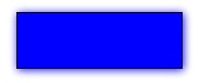
(Each of the examples in this article are live examples first, followed by a screen shot from Firefox 3.5 on OSX).
Similarly, you can draw an in-set shadow with the aforementioned keyword.
-moz-box-shadow: inset 1px 1px 10px #888;
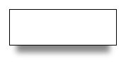
With the help of a spread radius, you can define smaller (or bigger) shadows than the element it is applied to:
-moz-box-shadow: 0px 20px 10px -10px #888;
If you want, you can also define multiple shadows by defining several shadows, separated by commas (courtesy of Markus Stange):
-moz-box-shadow: 0 0 20px black, 20px 15px 30px yellow, -20px 15px 30px lime, -20px -15px 30px blue, 20px -15px 30px red;
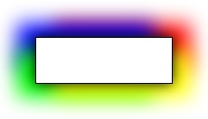
The different shadows blend into each other very smoothly, and as you may have noticed, the order in which they are defined does make a difference. As box-shadow is a CSS3 feature, Firefox 3.5 adheres to the CSS3 painting order. That means, the first specified shadow shows up on top, so keep that in mind when designing multiple shadows.
As a final example, I want to show you the combination of -moz-box-shadow with an RGBA color definition. RGBA is the same as RGB, but it adds an alpha-channel transparency to change the opacity of the color. Let's make a black, un-blurred box shadow with an opacity of 50 percent, on a yellow background:
-moz-box-shadow: inset 5px 5px 0 rgba(0, 0, 0, .5);
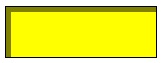
As you can see, the yellow background is visible though the half-transparent shadow without further ado. This feature becomes particularly interesting when background images are involved, as you'll be able to see them shining through the box shadow.
Cross-Browser Compatibility
As a newer, work-in-progress CSS3 property, box-shadow has not yet been widely adopted by browser makers.
-moz-box-shadow, as well as multiple shadows, the inset keyword and a spread radius.-webkit-box-shadow. Multiple shadows are supported since version 4.0, while neither inset shadows nor the spread radius feature are supported yet in WebKit.To achieve the biggest possible coverage, it is advisable to define all three, the -moz, -webkit, and standard CSS3 syntax in parallel. Applicable browsers will then pick and adhere to the ones they support. For example:
 -moz-box-shadow: 1px 1px 10px #00f;
 -webkit-box-shadow: 1px 1px 10px #00f;
 box-shadow: 1px 1px 10px #00f;
The good news is that the box-shadow property degrades gracefully on unsupported browsers. For example, all the examples above will look like plain and boring boxes with no shadow in MSIE.
Conclusions
The CSS3 box-shadow property is not yet as widely available in browsers (and therefore, to users) as, for example, the text-shadow property, but with the limited box shadow support of WebKit as well as the full support provided by Firefox 3.5 (as far as the current status of the feature draft is concerned), more and more users will be able to see some level of CSS box shadows.
As a web developer, you can therefore use the feature, confident that you are giving users with modern browsers an improved experience while not turning away users with older browsers.
Further resources Documentation
Examples
This kid is awesome:
He's 11 years old, and the world's fastest cup stacker. He made this "Fastest Firefox" video for the upcoming Firefox 3.5 launch. Of course Firefox can't stack cups, but its new TraceMonkey JavaScript engine is also one of the fastest in the world!
This is a cross-post of an article I wrote for the hacks.mozilla.org blog. It shows off some of the fun stuff web developers can do with the text-shadow feature that will be released as part of Firefox 3.5.
The text-shadow CSS property does what the name implies: It lets you create a slightly blurred, slightly moved copy of text, which ends up looking somewhat like a real-world shadow.
The text-shadow property was first introduced in CSS2, but as it was improperly defined at the time, its support was dropped again in CSS2.1. The feature was re-introduced with CSS3 and has now made it into Firefox 3.5.
How it Works
According to the CSS3 specification, the text-shadow property can have the following values:
none | [<shadow>, ] * <shadow>,
<shadow> is defined as:
[ <color>? <length> <length> <length>? | <length> <length> <length>? <color>? ],
where the first two lengths represent the horizontal and vertical offset and the third an optional blur radius. The best way to describe it is with examples.
We can make a simple shadow like this, for example:
text-shadow: 2px 2px 3px #000;

(All of the examples are a live example first, then a picture of the working feature — so you can compare your browser’s behavior with the one of Firefox 3.5 on OSX)
If you are a fan of hard edges, you can just refrain from using a blur radius altogether:
text-shadow: 2px 2px 0 #888;

Glowing text, and multiple shadows
But due to the flexibility of the feature, the fun does not stop here. By varying the text offset, blur radius, and of course the color, you can achieve various effects, a mysterious glow for example:
text-shadow: 1px 1px 5px #fff;

or a simple, fuzzy blur:
text-shadow: 0px 0px 5px #000;

Finally, you can add ”more than one shadow”, allowing you to create pretty “hot” effects (courtesy of http://www.css3.info/preview/text-shadow/ css3.info):
text-shadow: 0 0 4px white, 0 -5px 4px #FFFF33, 2px -10px 6px #FFDD33, -2px -15px 11px #FF8800, 2px -25px 18px #FF2200

The number of text-shadows you can apply at the same time in Firefox 3.5 is — in theory — unlimited, though you may want to stick with a reasonable amount.
Like all CSS properties, you can modify text-shadow on the fly using JavaScript:
Performance, Accessibility and Cross-Browser Compatibility
The times of using pictures (or even worse, Flash) for text shadows on the web are numbered for two reasons:
First, there are significant advantages to using text instead of pictures. Not using pictures saves on bandwidth and HTTP connection overhead. Accessibility, both for people who use screen readers and search engines, is greatly improved. And page zoom will work better because the text can be scaled instead of using pixel interpolation to scale up an image.
Second this feature is largely cross-browser compatible:
A caveat worth mentioning is the ”drawing order”: While Opera 9.x adheres to the CSS2 painting order (i.e., the first specified shadow is drawn at the bottom), Firefox 3.5 adheres to the CSS3 painting order (the first specified shadow is on top). Keep this in mind when drawing multiple shadows.
Conclusions
text-shadow is a subtle but powerful CSS feature that is — now that it is supported by Firefox 3.5 — likely to be widely adopted across the web in the foreseeable future. Due to its graceful degradation in older browsers, it can safely be used by developers and will, over time, be seen by more and more users.
Finally, some words of wisdom: Like any eye candy, use it like salt in a soup — with moderation, not by the bucket. If the web developers of the world overdo it, text-shadow may die a short, yet painful death. It would be sad if we make users flinch at the sight of text shadows like typography geeks at the sight of “Papyrus”, and thus needed to bury the feature deeply in our treasure chest.
That being said: Go try it out!
Further resources
Documentation
Examples
Today, Mozilla Corporation moved into new headquarters, across town, in Mountain View, California. The new place, which I have only seen as a building site so far, is bound to be awesome, judging by the photos that are slowly showing up on the web.
These and more photos are available on Deb Richardson's flickr feed (thanks, Deb!):


I can't wait to go visit!
Update: There are more photos of the new Mozilla office on osunick's flickr page.

 photo credit: daklebtwasTomorrow, June 7, 2009, the people of Europe elect the next European Parliament. Perhaps less well-known, this date also coincides with the local elections in the state of Baden-Württemberg, so besides the European ballot, I will also get to vote for
While possibly not the most influential councils of all, the number of elections at once is quite impressive. What makes these elections the most fun of all though, are the concepts of "Kumulieren" and "Panaschieren" that I'll shortly explain to you here.
Let's assume there are three active parties in this election: A light blue one, a pink one, and an orange one. For each of these, you'll receive a ballot containing their designated votees, along with the instructions telling you that you have, for example, 10 votes at your disposal.
Imagine you like the pink party the most. The easiest way to handle this is to take the pink ballot, fold it, and drop it into the ballot box. You'll automatically have given each of the people on the ballot 1 vote. But we are in Germany, and we find "simple" boring, so let's spice that up a bit.
It just happens that you like one guy in the Pink party, Paul Olitician, more than the others. After all, whenever you meet him at the bars, he buys you a beer, and to return the favor, you listen to him explain his political visions in detail. The perfect symbiosis, if you will.
In that case, you can go ahead and "accumulate" up to three votes on Paul, and then spread the remaining seven votes across the other candidates on the ballot. You may end up not having enough votes for each of the party members on there, but that's fine, as one of them is your former high school teacher whom you didn't like very much anyway. The process of giving a person on the ballot more than one vote is called "Kumulieren" in German.
But then, just before and you are done giving away all your votes, you realize there are empty lines left on each of the ballots. Also, you notice your neighbor John is a candidate for the light blue party. You don't want to vote for them as a whole, because you still like the pink party better, but you would like to vote for John. After all, you are still grateful for that one time when he heroically kept you from falling off the ladder when he caught you stealing from his cherry tree.
Luckily, the second concept called "Panaschieren" comes in handy. You manually write John's name onto the pink ballot, allowing you to give your remaining votes to him.
After you're done, you fold the ballot, stuff it into the envelope and drop it into the ballot box. With a strong feeling of accomplishment, you head to the bars. To discuss your successful voting with Paul, and to get rid of that horrific taste the envelope glue left in your mouth. You secretly promise yourself, next time you'll vote for the party to introduce self-adhesive envelopes to the German election system.
Google Calendar has a new feature that many international Mozillians may like: It can now display more than one time zone at a time. In my case, lining up the Central European and Pacific time zones next to each other comes in quite handy:

Of course, when entering a new event, it does not seem to allow selecting the time zone this refers to quite yet, let's hope that'll be fixed in a future iteration.
My colleague Dave made a little Google Maps mashup, illustrating where in the world Mozilla employees are. The result is quite an impressive map:

Over at Dave's blog, you can actually zoom in to see more closely where people are. The one in Munich, Germany, is yours truly, by the way.
 photo credit: confusedvisionHulu.com, the on-demand streaming video website established some 18 months ago by the US media companies as a platform for professionally produced content such as documentaries and TV shows, has signed a few contracts for the international market. For the international customers, that would be a good start, but it wouldn't go far enough. Why is that, you might ask?
What the consumer cares about When it comes to digital media, there are three major aspects the consumer cares about. They want to have:
The content they like... What sounds trivial at first has long been a major problem, both nationally and internationally. As an international consumer, content is often not available at all, available later, or not available in the preferred language. For example, all American TV shows that reach Germany at all (and that's much fewer than there are on the US market every year) are dubbed to German. This may be pleasant to some, but it also makes it insanely hard to acquire the original language versions, as the original sound track is not broadcast even on digital TV. Buying the DVD is an option, but that can sometimes take several years after the original air date. Some shows don't make it to DVD at all, either because the media companies don't deem it profitable, or because the content licensing takes forever (e.g., the first season of Crossing Jordan took over 6 years to be released, the other five are still MIA).
Hulu can help with this. Where it has been impossible for customers to get the TV shows legally that they would like to watch, people started file sharing on the Internet. With projects like hulu.com, the media companies can do what they should have done all along: Offer a legal way for the customers to watch what they like, without being forced to download it elsewhere, with questionable legality.
At the place and time they prefer... This is another issue that's long been "built" into TV broadcasts: When a show is gone, it's gone. And despite the fact that "on demand" has become somewhat of a buzz word lately, it's been been more pay-per-view movie related and even PVRs aren't quite the breakthrough yet in this respect: If you forget to plan ahead, your show won't be recorded, and you are out of luck. Tivo is helpful there, but once again, unavailable internationally.
When it comes to the place, things get even worse: If you want to watch your favorite TV shows on the train or in the car, you are as of yet completely out of luck: I don't know of a PVR that allows you to easily take its content with you, say, on your iPod. Hulu itself is isn't very helpful there either: Even with the growing availability of 3G phone networks, the Flash-based hulu player won't work on the iPhone, for example, leaving you stranded right there and then.
... in the format they require. ... which leads to the last and most severe problem: Even with Hulu offering content more widely than before, customers are still bound to a very limited distribution channel. So far, this means it's browser-only. For mobile devices without Flash, that's a bummer, and furthermore there's no offline viewing, so you are equally left out as before while on the road outside major metropolitan areas. At last, hulu has not made content available any easier even in the living room, by most recently prohibiting its content from being shown through boxee, a free media center software.
It's long been some sort of crazy "competition" between different content providers to control formats rather than content as strongly as possible, and in effect, they have lobbied many parliaments in the world (including the US and Germany) into laws prohibiting format conversions on grounds of "circumventing encryption". While audio content is more freely available now (in the DRM-free iTunes, Amazon, and Wal-Mart music stores, for example), video content is still greatly restricted and virtually not convertible to other formats legally. And there is no indication that the video industry makes any effort not to repeat the same mistakes the audio industry already went through.
Long story short Long story short, the push for international availability of hulu.com is a good start for the consumer. It may soon get the content consumers want to them, almost when and where they want it. Still, the content remains highly restricted and it is not in sight if and when that will change. Until the consumers are able to achieve format transparency through legal channels though, many may keep employing file sharing or DVD copying as their only viable alternatives.
Soon, I'll fly to the US on a business trip, so I checked into my flight with Lufthansa earlier today. As most airlines nowadays, they let you choose where you'd like to sit, which looks something like this:

Sadly, this is hardly accessible for people with "disabilities": Not only is it a Flash application (which is a pretty bad idea accessibility-wise anyway), but also for people with red-green colorblindness (like myself), it is extremely hard to distinguish occupied seats from empty ones, as they only differ in color, and do not have any additional distinguishing features.
When you look at other airlines' seat selectors, you'll notice that Lufthansa has, in comparison, made a particularly bad choice. Northwest Airlines' seat selector, for instance, looks like this:

The difference is obvious: When a seat is occupied, instead of bothering only with a different color, NWA just puts a little person into the spot. In addition, other meaningful symbols are employed to display other options, such as accessible seating (wheelchair symbol) or seats that can be purchased for an additional fee (the dollar sign).
What's so bad about Lufthansa's design choice is that the most central difference in this UI is no different at all when you find yourself among the approx. 6 % of males with deuteranomaly.
What does this mean for developers? It may sound trivial, but: Make similar things similar, and different things different. If you have a very limited set of UI elements for the task at hand, make them sufficiently different for the user to distinguish without guesswork -- this won't only help the "challenged" users, but all of them will need less time and thinking, and thus have a better user experience. There's more to UI design than color, as Alex Faaborg outlined in this an older blog article about quantitative design.