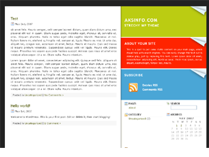
As only the most attentive readers may have noticed by now, I redesigned my blog. It's been a while since I have done that, and the former layout started to bore me a little.
So I went ahead, got myself a template from freecsstemplates and tweaked away. It wasn't a Wordpress template, so there was quite a lot of work to do, but I am quite pleased with the outcome.
 Gone: The old design.
There are a few advantages of the old vs. the new layout. First, more room for more awesomeness: The articles used to be only 500 pixels wide (and that was already stretched from how the old layout came out of the box). This one has 575 pixels, plenty of space even for bigger pictures.
"New car" scent not included.
Second, due to the famfamfam icons I built in it should all look a little neater and be hopefully quite intuitive. Just for fun, I also added "magazine-style" quotes, just like the one you see on the right.
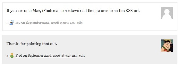
At last, my comments now differ visually from everybody else's:

I hope you like it. Oh, and if you find anything out of the ordinary, let me know!