Recently, I have to do a lot of point plots for one of my classes, i.e. taking huge amounts of two-dimensional data points, having them "drawn" and printing out the resulting image.
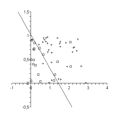
Usually, for this job, I used Maple, mostly because this is my computer algebra system of choice since I used it in my advanced math course in high school. It is just so much better in tedious arithmetic than I am ;). Writing a little script, I read in the provided data file by the teacher and returned an expression that I could directly copy and paste into Maple. The resulting graphs look somehow like this:
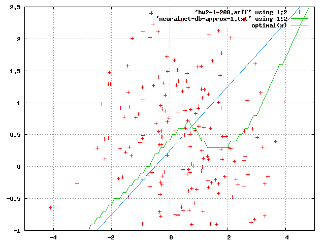
However yesterday, I managed to break Maple. I read in two lists of a few hundred data points each and wanted to plot them together with a function in one plot. So far so bad: In spite of the correct syntax, I got some evaluation errors and an empty plot. Great.
So I tried gnuplot, the apparent "industry standard" for all sorts of scientific data and function plots (unless, of course, you spend a sh*load of money on Matlab ;)). And, within minutes, thanks to the numerous howtos on the Internet I was able to make much more beautiful (and working) plot such as this one:
And I finally understand why so many people are using it: It is just the right tool for the job.
One tutorial I want to point out in particular are the not so frequently asked questions that helped me a lot to get the trivial, not-so-trivial-after-all tasks done to get a little more sleep and spend a little less time on homework. :)