This is another cross-post of an article I wrote for the hacks.mozilla.org blog. It shows off some of the fun stuff web developers can do with the -moz-box-shadow feature that will be released as part of Firefox 3.5.
Another fun CSS3 feature that's been implemented in Firefox 3.5 is box shadows. This feature allows the casting of a drop "shadow" from the frame of almost any arbitrary element.
As the CSS3 box shadow property is still a work in progress, however, it's been implemented as -moz-box-shadow in Firefox. This is how Mozilla tests experimental properties in CSS, with property names prefaced with "-moz-". When the specification is finalized, the property will be named "box-shadow."
How it works
Applying a box shadow to an element is straightforward. The CSS3 standard allows as its value:
none | <shadow> [ <shadow> ]*
where <shadow> is:
<shadow> = inset? && [ <length>{2,4} && <color>? ]
The first two lengths are the horizontal and vertical offset of the shadow, respectively. The third length is the blur radius (compare that to the blur radius in in the text-shadow property). Finally the fourth length is the spread radius, allowing the shadow to grow (positive values) or shrink (negative values) compared to the size of the parent element.
The inset keyword is pretty well explained by the standard itself:
if present, [it] changes the drop shadow from an outer shadow (one that shadows the box onto the canvas, as if it were lifted above the canvas) to an inner shadow (one that shadows the canvas onto the box, as if the box were cut out of the canvas and shifted behind it).
But talk is cheap, let's look at some examples.
To draw a simple shadow, just define an offset and a color, and off you go:
-moz-box-shadow: 1px 1px 10px #00f;

(Each of the examples in this article are live examples first, followed by a screen shot from Firefox 3.5 on OSX).
Similarly, you can draw an in-set shadow with the aforementioned keyword.
-moz-box-shadow: inset 1px 1px 10px #888;

With the help of a spread radius, you can define smaller (or bigger) shadows than the element it is applied to:
-moz-box-shadow: 0px 20px 10px -10px #888;

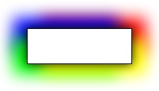
If you want, you can also define multiple shadows by defining several shadows, separated by commas (courtesy of Markus Stange):
-moz-box-shadow: 0 0 20px black, 20px 15px 30px yellow, -20px 15px 30px lime, -20px -15px 30px blue, 20px -15px 30px red;

The different shadows blend into each other very smoothly, and as you may have noticed, the order in which they are defined does make a difference. As box-shadow is a CSS3 feature, Firefox 3.5 adheres to the CSS3 painting order. That means, the first specified shadow shows up on top, so keep that in mind when designing multiple shadows.
As a final example, I want to show you the combination of -moz-box-shadow with an RGBA color definition. RGBA is the same as RGB, but it adds an alpha-channel transparency to change the opacity of the color. Let's make a black, un-blurred box shadow with an opacity of 50 percent, on a yellow background:
-moz-box-shadow: inset 5px 5px 0 rgba(0, 0, 0, .5);

As you can see, the yellow background is visible though the half-transparent shadow without further ado. This feature becomes particularly interesting when background images are involved, as you'll be able to see them shining through the box shadow.
Cross-Browser Compatibility
As a newer, work-in-progress CSS3 property, box-shadow has not yet been widely adopted by browser makers.
- Firefox 3.5 supports the feature as
-moz-box-shadow, as well as multiple shadows, theinsetkeyword and a spread radius. - Safari/WebKit has gone down a similar route as Firefox by implementing the feature as
-webkit-box-shadow. Multiple shadows are supported since version 4.0, while neither inset shadows nor the spread radius feature are supported yet in WebKit. - Finally, Opera and Microsoft Internet Explorer have not yet implemented the box shadow property, though in MSIE you may want to check out their proprietary DropShadow filter.
To achieve the biggest possible coverage, it is advisable to define all three, the -moz, -webkit, and standard CSS3 syntax in parallel. Applicable browsers will then pick and adhere to the ones they support. For example:
 -moz-box-shadow: 1px 1px 10px #00f;
 -webkit-box-shadow: 1px 1px 10px #00f;
 box-shadow: 1px 1px 10px #00f;
The good news is that the box-shadow property degrades gracefully on unsupported browsers. For example, all the examples above will look like plain and boring boxes with no shadow in MSIE.
Conclusions
The CSS3 box-shadow property is not yet as widely available in browsers (and therefore, to users) as, for example, the text-shadow property, but with the limited box shadow support of WebKit as well as the full support provided by Firefox 3.5 (as far as the current status of the feature draft is concerned), more and more users will be able to see some level of CSS box shadows.
As a web developer, you can therefore use the feature, confident that you are giving users with modern browsers an improved experience while not turning away users with older browsers.
Further resources Documentation
- https://developer.mozilla.org/en/CSS/-moz-box-shadow
- http://dev.w3.org/csswg/css3-background/#the-box-shadow
Examples


