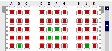
Soon, I'll fly to the US on a business trip, so I checked into my flight with Lufthansa earlier today. As most airlines nowadays, they let you choose where you'd like to sit, which looks something like this:

Sadly, this is hardly accessible for people with "disabilities": Not only is it a Flash application (which is a pretty bad idea accessibility-wise anyway), but also for people with red-green colorblindness (like myself), it is extremely hard to distinguish occupied seats from empty ones, as they only differ in color, and do not have any additional distinguishing features.
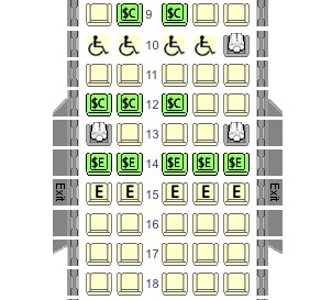
When you look at other airlines' seat selectors, you'll notice that Lufthansa has, in comparison, made a particularly bad choice. Northwest Airlines' seat selector, for instance, looks like this:

The difference is obvious: When a seat is occupied, instead of bothering only with a different color, NWA just puts a little person into the spot. In addition, other meaningful symbols are employed to display other options, such as accessible seating (wheelchair symbol) or seats that can be purchased for an additional fee (the dollar sign).
What's so bad about Lufthansa's design choice is that the most central difference in this UI is no different at all when you find yourself among the approx. 6 % of males with deuteranomaly.
What does this mean for developers? It may sound trivial, but: Make similar things similar, and different things different. If you have a very limited set of UI elements for the task at hand, make them sufficiently different for the user to distinguish without guesswork -- this won't only help the "challenged" users, but all of them will need less time and thinking, and thus have a better user experience. There's more to UI design than color, as Alex Faaborg outlined in this an older blog article about quantitative design.
