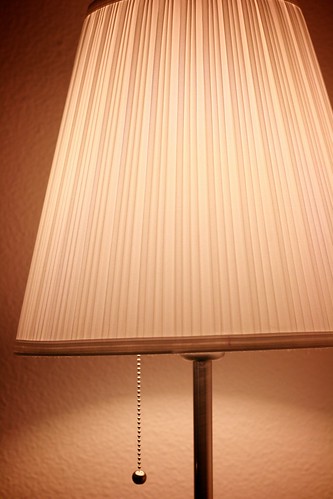
Along the same lines of my industrial design-inspired photo on day 55, I really like this photo of one of our lamps because of its straight lines and the simplicity of its dangling pull chain. To my dismay, it is a little crooked (oops) but still. Another subtle detail I enjoy is the parabola shape the light makes on the wall.
A side note on the postprocessing: On some of my other pictures, I've pretty aggressively fixed the white balance before, so that what's white in daylight was white in the photo too despite the artificial light I took the photo in. On this one, I deliberately didn't do that: I like how the photo shows how the shade actually looks (the bulb inside has a "warm white", i.e. somewhat yellowish, hue), rather than what it would look like if there somehow was daylight shining on the inside.
