Let me preface this by saying: While I have some education in the field, and I create user experiences in software on a daily basis, I am not a User Experience professional. So take this with a grain of salt, and feel free to comment on this and point out where I err.
Sore Thumbs
It lies perhaps in the nature of user experiences that good ones are easy to miss (as they're virtually effortless) and bad ones stick out like a sore thumb until eventually the constant friction adapts the user to the tool (and not vice versa).
An odd mixture of good and bad UX seems to be the world of cars. While car manufacturers take design very seriously, some seemingly innocuous design choices can greatly affect your safe (and sane) driving. One of my pet peeves is the cruise control.
Exhibit 1: Basic safety
Let's take a look at some very recent cruise control designs, like this one:
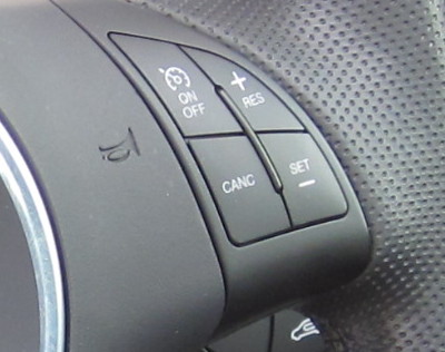
Four flat buttons. There's a little bar in between so you find them blindly, but no indication what each button means. Until you remember (so, perhaps: never), you have to look down to press exactly the right button at the right time. If you hit the wrong one (resume instead of set!), your car might speed up madly instead of holding the current speed. Or you'll have to slam your breaks because you failed to find the cancel button quickly enough.
This is just all around bad and potentially dangerous UI design.
Exhibit 2: False Friends
Second example:
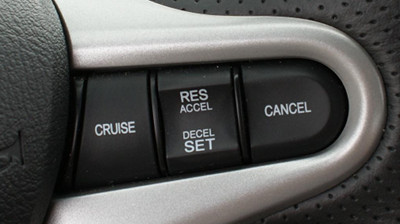
This is a lot better (safer, anyway) by making the different switches all feel different. Once you figure out which one is the on/off switch, accelerate/decelerate (or resume/set) and cancel are easy to distinguish. You're probably not going to rear-end someone while trying to figure out where the cancel button is.
Yet, common inteaction models still require a lot of effort. Imagine:
You're on the freeway, speeding up to the speed limit. You turn on the cruise control, and hit set. Now, a truck passes another in front of you. You hit cancel, hold your lower speed and once the truck has passed, you want to go back to your previous speed. So you try to remember which one was the resume button (Up or down? Let's look, just to be sure). Finally, you press resume.
Notice something?
Unlike accelerate/decelerate, the functions set and resume are actually not complementary. Yet, they are frequently mapped to the same buttons. Check your own car, chances are yours has it too.
Exhibit 3: What belongs together*
From the scenario above, we actually have these 4 groups:
- on / off
- set
- cancel / resume
- accelerate / decelerate
Arguably the most important are cancel and resume, because you want to ensure that the user hits cancel when they need to, and resume (only) when they want to, and not accidentally.
Set is necessary, of course, and accelerate/decelerate are icing on the cake.
The first ever design I have seen following these principles is actually this one, from a 2013 model year:
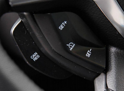
This design does a lot of things right: on/off is small but easy to find in the middle of the rocker button. Both up and down are set, colocated with accelerate/decelerate (+ or -, doesn't matter to the driver when first setting the speed), and cancel / resume are actually a huge "trigger"-style button underneath.
These small changes go a long way: The panel can be used blindly with little chance for mistakes, and it reduces the amount of traveling your fingers have to do to perform related actions.
Four decades and counting
The modern cruise control was introduced about four decades back, and still, in all those years no "best practices" user interface has been established yet. In fact, even in 2013, manufacturers still seem to blindly copy previous designs, no matter how bad an idea they may be.
Keep that in mind when you build things (be it cars, space ships or software). Just because something has been around for a long time, it is probably not perfect yet (in fact, far from it). Never stop challenging the way it has previously been built. Never stop improving.
Update, Feb. 5: Martin pointed out that "res" stands for "resume", not "reset", so I changed the phrasing. Sorry for the confusion.
I'm blogging about once a week in 2013, on various topics. This is my post for week 5 of 2013. (My intent readers may have noticed I missed week 4: I know, I owe you one.)